Multivariate Analysis
Category > Data Exploration
Mon 05 September 2022Multivariate Analysis
Welcome to the fourth tutorial video on data exploration. In the former videos, we concentrated on uni- and bivariate analysis. In this video, we conclude the exploration of the bike-sharing dataset with a more sophisticated multivariate analysis, complementing the analyses presented before.
At the end of the last video, we validated that the elevation plays a major role in explaining why some stations are unbalanced with respect to arrivals and departures. In other terms, the elevation embodies the 'cost' that a user has to face when moving between stations that are at different levels. This aspect, that is the cost of reaching nodes within a network, is a general problem that is faced in network analysis for identifying the best routing. For this reason, we continue the previous analysis by focusing on the 'cost' of reaching stations without the need of using the elevation explicitly. By making this problem more generic, the proposed analysis can be applied also to other networks where there are 'costs' for traveling between nodes which influence routing. We redefine hence the previous problem setting as follows: each bike station represents a node of a network and each node is connected through an edge to all other nodes of the network. The single edges are bidirectional, and each direction has an associated cost. In our case, the cost is represented by the time required for traveling between two stations. We assume that given the same distance, the time required for moving between two stations is determined by the difference in elevation, hence, biking uphill requires more time than biking downhill. As a first step to perform this analysis, we compute the trip duration among unbalanced stations. An excerpt of these trip durations is provided in the table on the right.

The table shows the cost hence, the time it takes to reach a given node when departing from another one and vice versa. In the example, we see that the cost to go from Cal Anderson Park, 11th Avenue & Pine Street to E Harrison Street & Broadway Avenue East is less expensive than taking the return way with a time difference of less than a minute. Hence, it is slightly faster to go in one direction than in the opposite direction.
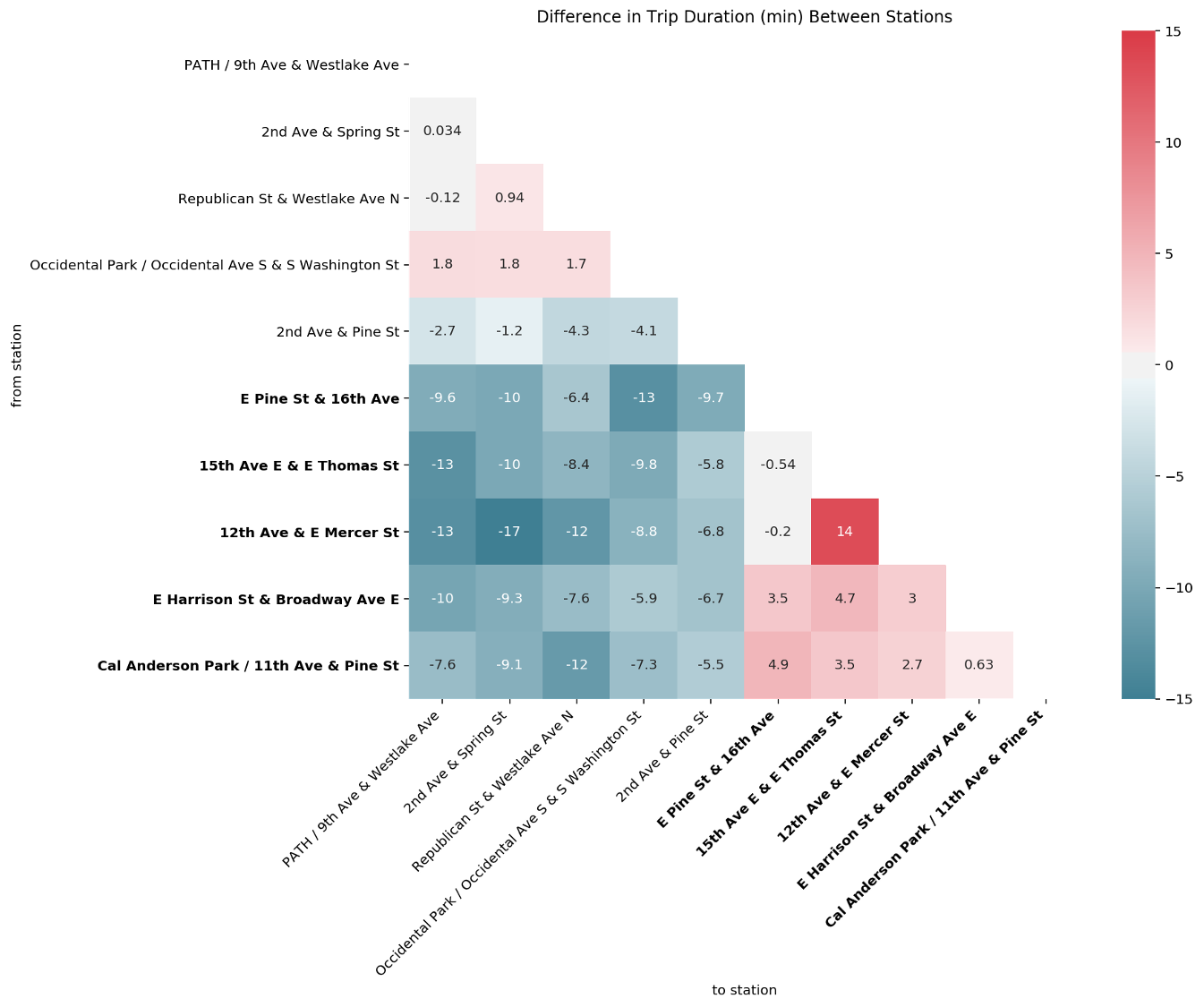
From this table, we plot a matrix depicting the difference of trip durations between each couple of unbalanced stations. The colour map indicates how much longer the median trip duration is from one station to the other, hence the higher the values, the redder the colour and as such, the bigger is the difference between the costs in the two directions. If the colour tends to a darker blue, the difference is negative such that it takes less time from station A to station B than the return way. To facilitate the visualization of the stations located in Capitol Hill, and therewith with a high elevation, the names of these stations are reported in bold letters.
We observe that the connection from 12th Avenue & E Mercer Street to 2nd Avenue & Spring Street has the largest negative difference indicated by the cell with the most intense blue colour. In addition, we can see that the first one is located in Capitol Hill while the latter is located downtown. Similarly, the connection between Cal Anderson Park, 11th Avenue & Pine Street for example, which is also located in Capitol Hill, to Republican Street & Westlake Avenue North, located downtown, also shows a large negative difference. In fact, all stations located in Capitol Hill show a significant negative difference compared to the stations located downtown. This is consistent with the previous observation that the first group of stations are located at a higher elevation than the second group. Between the stations located downtown we can observe light - positive and negative - differences, which might be due to the particular relief characteristics and traffic organization of Seattle's downtown road network. Finally, between the stations located in Capitol Hill, we observe a slight positive difference, again likely revealing particular relief and traffic organization characteristics of that area. An exception is the large positive difference observed between 12th Avenue & E Mercer Street and 15th Avenue East & E Thomas Street. If we inspect the elevation of these two stations, we observe that there is a difference of 10m between them, which might at least partially explain their difference in trip duration as other pairs of stations exhibit a higher difference in altitude.
Another interesting fact revealed during the bivariate analysis was the relationship between gender and the stations of arrival. In this analysis we want to further explore how this relationship evolves during the week. As a first step, we take the top ten stations of arrival on weekdays during the morning rush hour. We focus on this time window since we assume that it is used by bikers to go to work. For these stations, we check whether they are more popular among men or women.
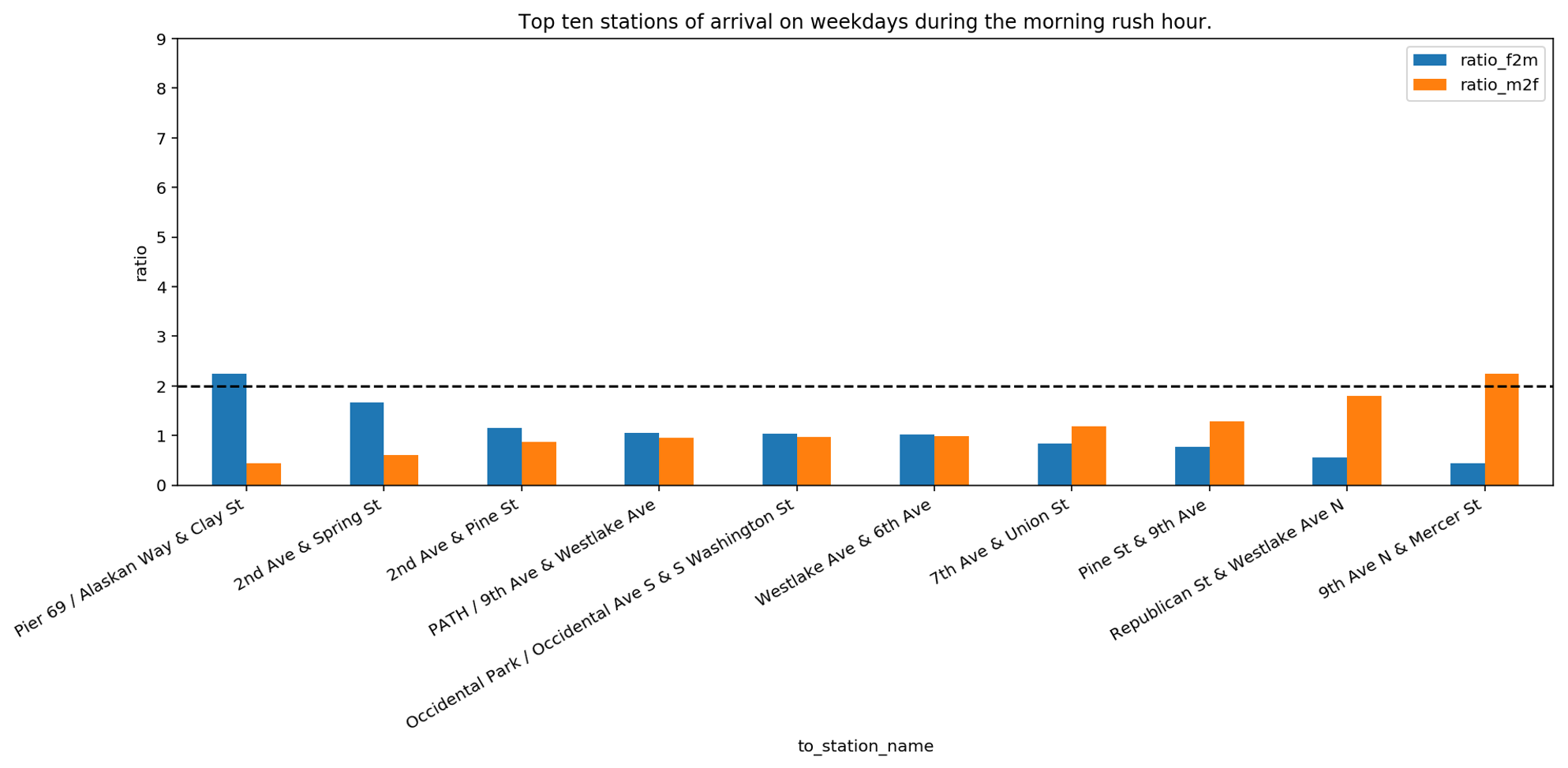
We can see that Pier 69, Alaskan Way & Clay Street is twice more popular for women than for men, whereas 9th Avenue North & Mercer Street is twice more popular for men than women. For all other stations, the difference is smaller, meaning that the popularity of a station of arrival in the morning rush hours is similar. If we compare this bar plot with the previous one in the former video we realize that the difference in ratio is significantly lower. This can signify that on weekdays, during rush hours, both men and women are going toward the same gathering places. To inspect this hypothesis, we now focus on stations of arrival during the weekend. The assumption is that during weekends bikers may go to different places than their work location, for example, to follow their personal interests and hobbies. For this reason, we use all stations of arrival that are reached on weekends. For these stations, we check whether they are more popular among men or women.
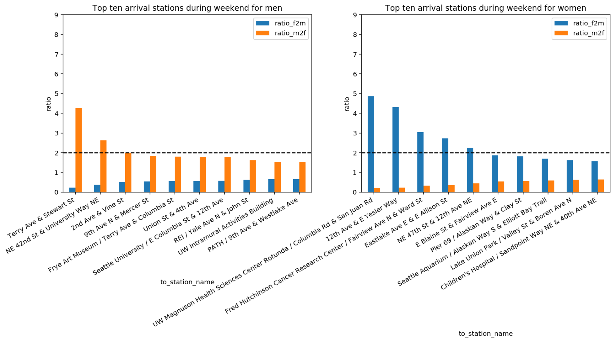
With this analysis, we discover that during the weekend men and women have different favourite stations of arrival. Moreover, if we compare the last three bar plots, we discover that the ratio of men vs women of the top stations of arrival changes during the week. Indeed, we can see that on weekends there are in total seven stations where the ratio of women to men or the ratio of men to women is above 2. During weekdays this ratio was above 2 for only two stations. This seems to imply that, in absence of constraints like the location of the working place, gender plays a role on where bikers go. We complete this analysis by plotting the previously identified stations on the map. We distinguish between the following criteria: We use blue circles for the top 10 stations which are reached in the morning rush hours during weekdays, green circles for the top 10 stations which are reached by women during weekends and red circles for the top 10 stations which are reached by men during weekends.
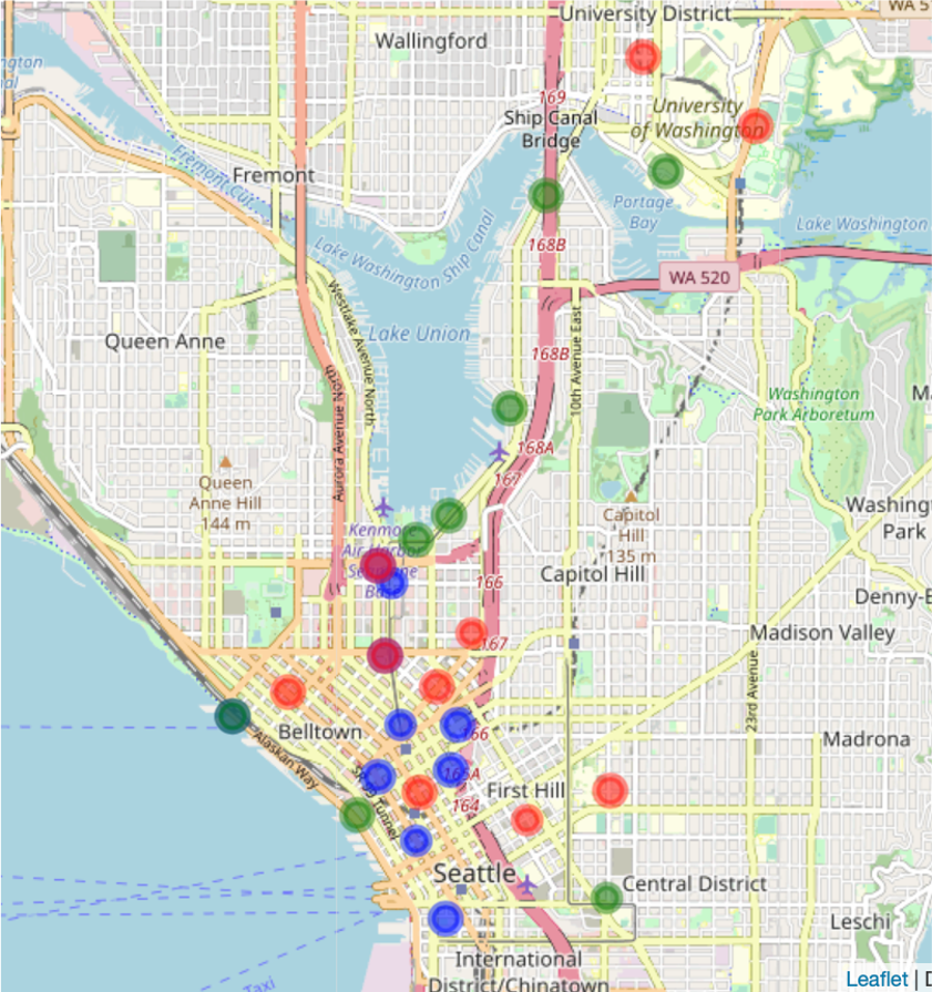
Note that red circles appear in a light red tone, close to orange while superposition of blue and red circles results in a dark red colour and superposition of green and blue circles results in a dark green colour.
The distribution of circles of different colours confirms that the popular arrival stations during weekdays do not match with the popular stations reached by men and women during weekends. Further, it confirms that there are popular locations of arrival during weekends in the University district which were not present during weekdays.
In order to further explain the differences observed during weekends, a more in-depth knowledge about the city and the shared habits of its inhabitants would be required, which falls outside the scope of this tutorial.
Authors: EluciDATA Lab
Permanent URL